Twitter is testing big ol’ full-width photos and videos

Written by Taylor Hatmaker
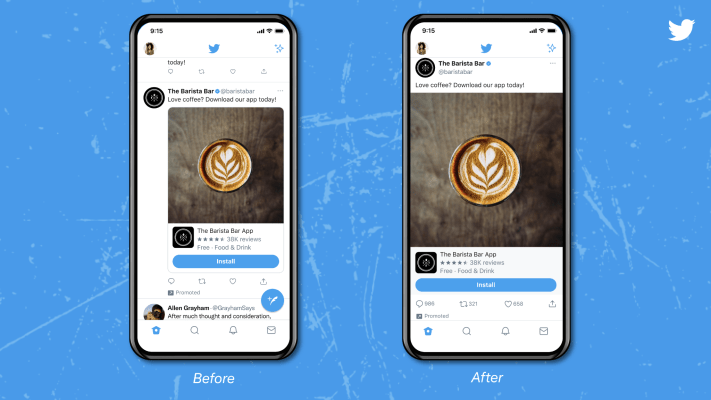
Twitter is exploring ways to build a more visually immersive experience with its latest test, which brings edge-to-edge tweets to the app on iOS.
Full-width images and videos track for the direction the company has shown some interest in going lately. Twitter introduced bigger images with improved cropping controls for its pair of mobile apps earlier this year, making plenty of photographers and other visual artists happy that the social network was suddenly a much friendlier platform for sharing their work.
In the current test, tweets fill the full frame from left to right instead of being offset by a pretty large margin on the left.
The changes result in much larger images and videos that look better in the feed and a cleaner, more modern design that doesn’t unnecessarily squish tweets to the right of users’ profile pictures.
In testing the feature, Twitter says that it wants to encourage users to have conversations across photos and videos, rather than focusing solely on text like the platform traditionally has.
While the result looks like a win to us, any change to Twitter’s design is likely to inspire a vocal subset of users to hate-tweet about it for a day or so before forgetting the changes altogether.


